logo
  • en
  • de
  • Work.
  • Clients.
  • Blog.
  • About.
  • Academy.
  • Contact.
  • X

ACCESS LOGISTIC.

Love a little. Give a little.

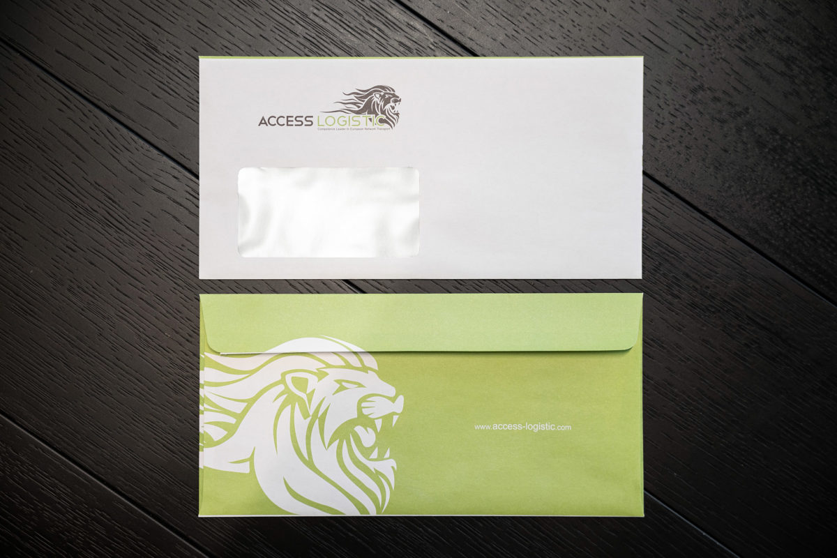
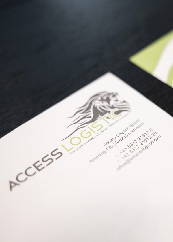
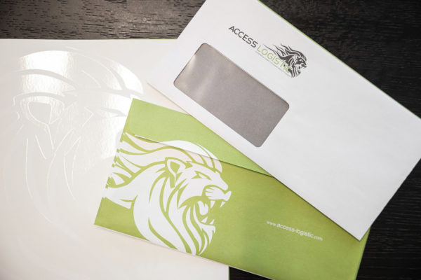
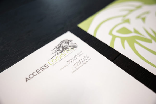
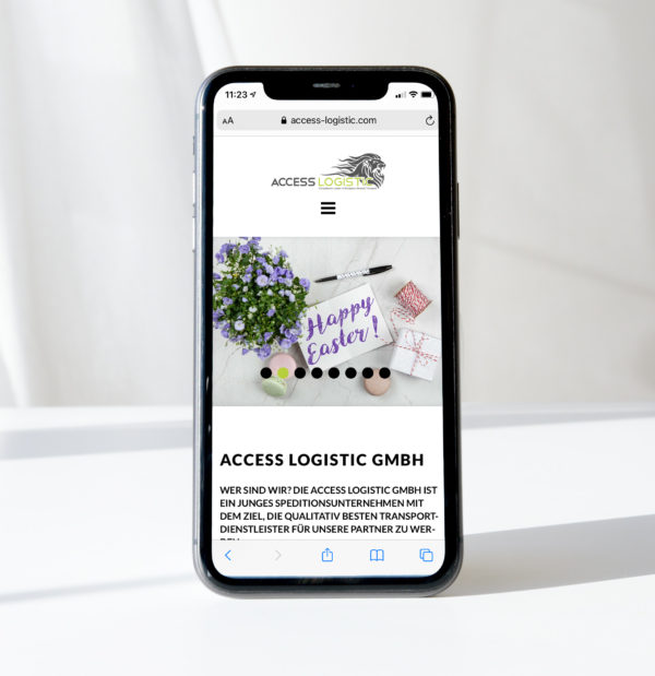
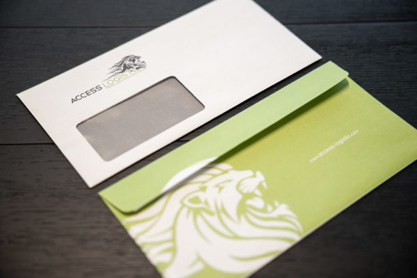
Here is the brief: We want to be seen, colourful, draw attention and work with strong visual design. The website should be cheap, easy to navigate and fast. We come up with a roaring lion as the visual representation of the company. The lion stands for strength, speed, stamina and exactly those values need to be represented by a logistics partner.

Everyone involved, be that client, employee, partner, supplier. The logo was love at first sight and we were ready to go! Lionhead.

Effective brandig always starts with the necessary research. How to position the company, what is the target group, what is to be achieved, how courageous is one in the visual statements. After many workshops and consultations, we believe that the result is the bomb!

Needless to say, the colours needed to reflect the right hues on all of the different media and print collateral. With the chosen colour being lime-green we surely would not want a shady dark green in any of the literature all of a sudden because the colour grades weren’t mixed in the right way.

Quality control, expert consulting, years of expertise, passion and our motto: Bold. creative. progressiv. And that is what we’re proud of.

Office Austria:

artdirection4u ADVERTISING GmbH

Salurner Straße 22
6330 Kufstein

  • Privacy Policy
  • Imprint

Contact: Contact

t. +43.5372.22435

Call Us.

+43.5372.22435

Do It.

Be Happy.