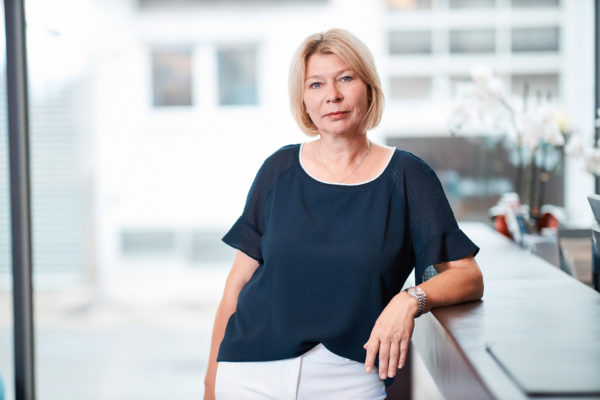
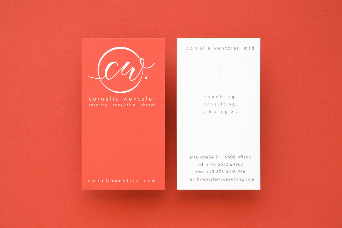
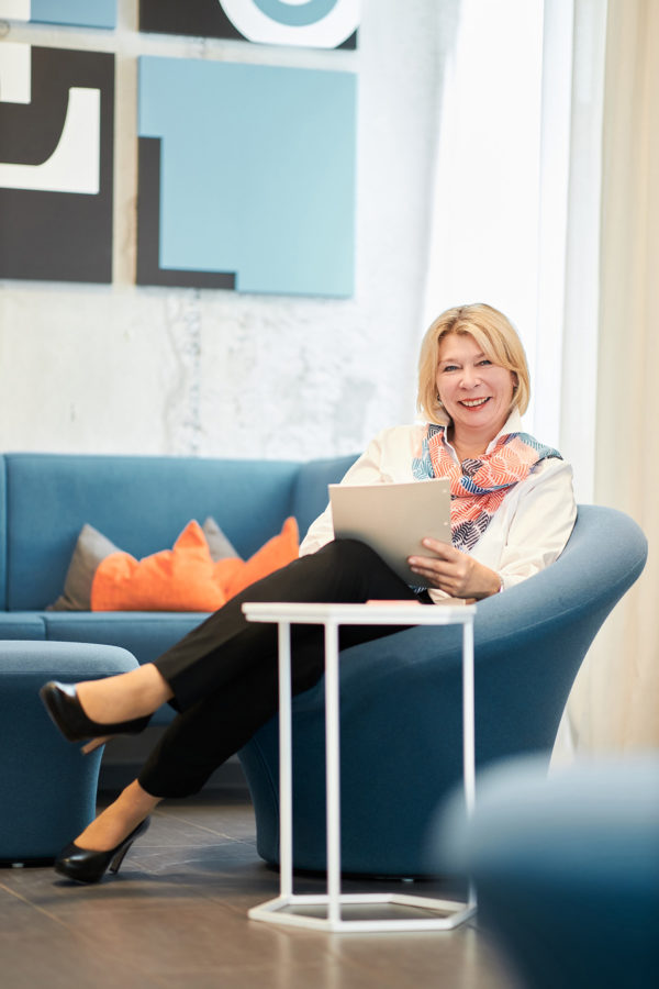
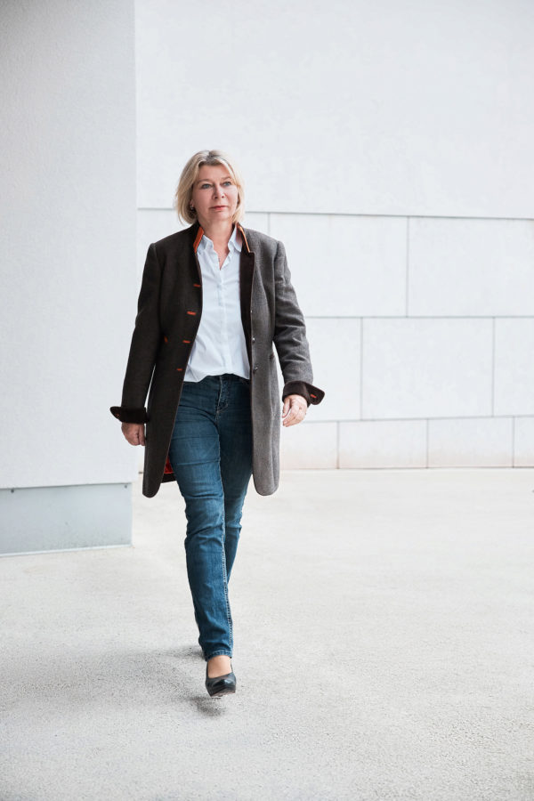
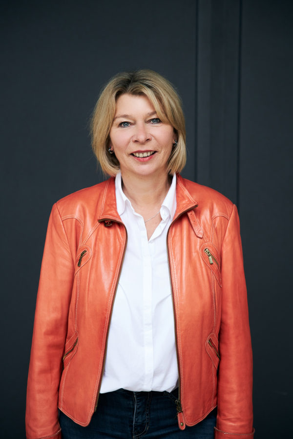
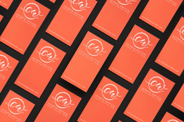
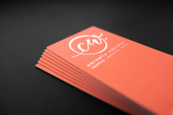
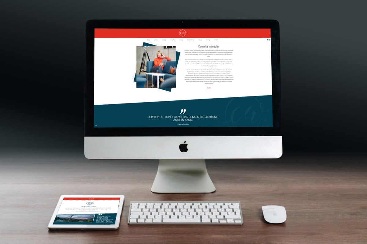
Vibrant and inviting colours, a key concept, a new logo with a clear USP, photography and a new website were our recommendations. Simply branding that would show the core of Cornelia’s work as well as the philosophy behind it. A visual representation that invites novelty and change. To showcase the work of personal development and progress in a friendly and tangible way. That was our task. From Slogan to identity, from Ci to a fresh website as a tool with ROI. Business cards, stationery, completed the package and added the finishing touches. The flow continues! Thank you for your trust!